Therapist website examples, and what to examine.
A screenshot gallery cannot tell you whether a practice site is clear, credible, fast, or easy to use. This guide gives you 8 practical checks, then shows how 2 live, publicly credited TMN projects handle the same decisions in different behavioral-health settings.
- 8 checks
- Use on any practice site
- 2 live sites
- Publicly credited
- 1 direct path
- Primary intake action
- $2,250+
- Published TMN pricing
8 traits, each one checkable.
Open any therapy site, including your own, and review it honestly. These are the questions a prospective client is trying to answer before they reach out.
Licensure and specialty in the first screen
LCSW, LMFT, LPC, PsyD, and what you actually treat. Someone looking for trauma work needs to know in seconds whether they are in the right place. A welcome message and a photo of a couch answers neither question.
Fees stated plainly
Session fee, sliding scale if you offer one, and what happens at intake. Clear fee information helps self-pay clients assess practical fit before they contact the practice.
Insurance answered directly
Which panels you are on, or a clear statement that you are out-of-network with superbill support. This lets prospective clients assess basic coverage before they contact the practice.
A specialty page per problem
Anxiety, trauma and EMDR, couples, teens, perinatal, grief. People often search by problem or specialty. A focused page gives visitors a clear answer and gives search engines and AI systems a crawlable source they can evaluate and potentially cite.
One primary path to start
One obvious way to start, routed into the scheduling or intake system the practice has approved. Other contact options can remain available, but the primary action should match how the practice actually responds.
Crisis resources where they belong
988 and local crisis resources placed where the practice's clinical reviewers require them, with approved language distinguishing the site from an emergency channel.
Quiet, fast, and readable on a phone
A prospective client may be reading late at night on a phone. No autoplay, pop-ups, countdown offers, or chat widget interrupting the page. Restraint fits the setting and keeps the page lighter.
Public forms do not invite clinical narratives
Unless the practice has approved the full workflow and safeguards, public marketing forms should stay narrow and clinical intake should route through practice-selected systems. See the sourced guide to HIPAA considerations for practice websites.
Two live projects, checked against the list.
Both are live on their own domains and credit TMN publicly. LumiClinics is a psychiatry and therapy practice. Training Wheels ABA is an adjacent behavioral-therapy example, not a private-practice therapist site.
LumiClinics · psychiatry and therapy
A Northbrook, Illinois practice serving patients statewide by telehealth. Named providers with credentials lead, insurance is written in plain language, and one direct intake path is prominent. Case study or the live site.
Training Wheels ABA · behavioral therapy
An adjacent pediatric ABA example with 3 Austin-area clinics. The site separates parent and clinician journeys, explains insurance including Medicaid, and gives families a direct path to schedule a tour. Case study or the live site.
What both have in common
Credentials before persuasion, practical access information, and a clear next step. Each site reflects its own clinical setting and approved content. For a multi-provider clinic approach, see mental health clinic websites, or how to verify any claim TMN makes.
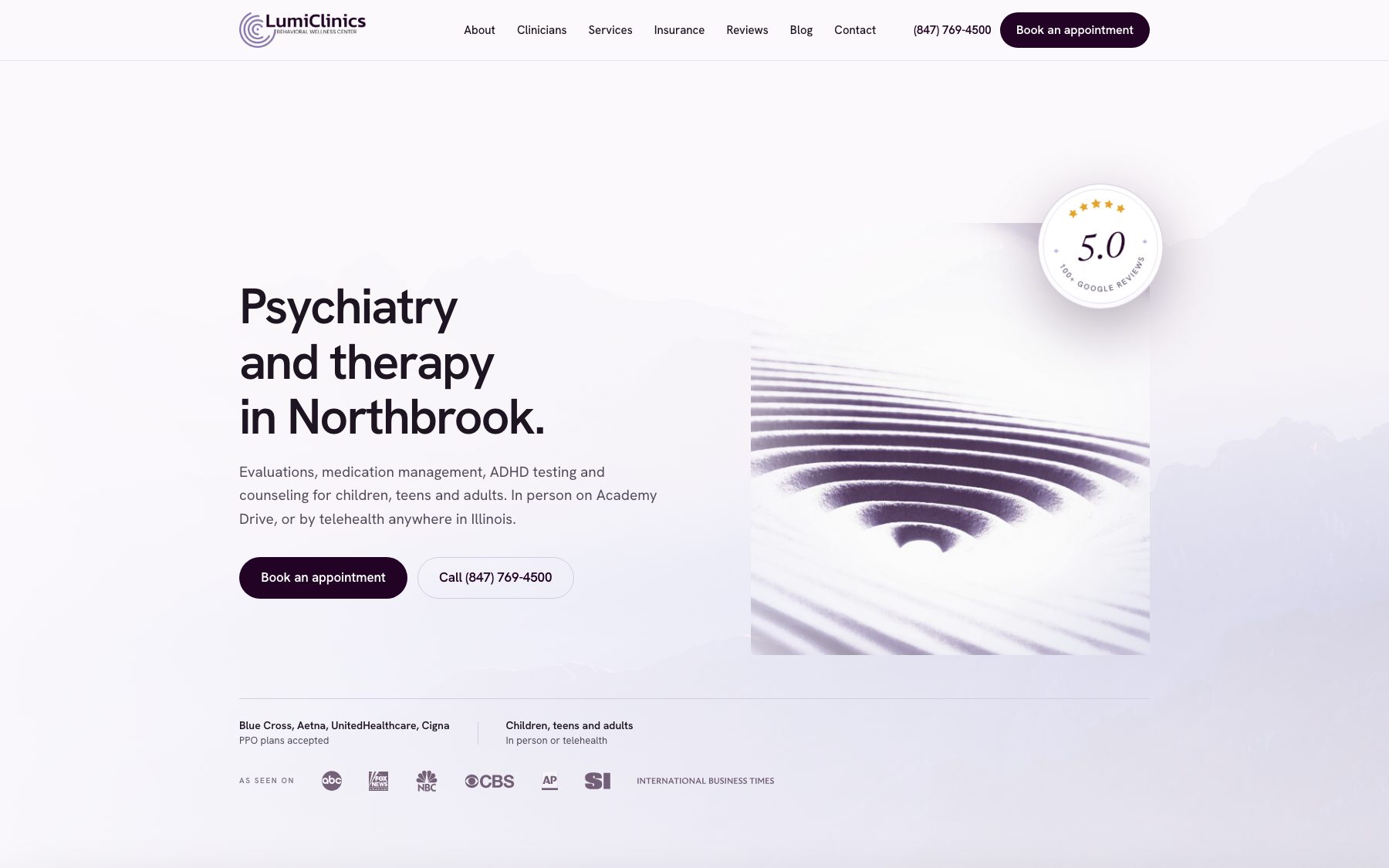
| Check | LumiClinics | Training Wheels ABA | What to take from it |
|---|---|---|---|
| 1. People and scope | Direct fit. Named psychiatry and therapy providers with stated credentials. | Adjacent fit. Clinic model, services, and locations are clear. It is not a solo-clinician example. | Name the people or care model a visitor is actually choosing. |
| 2. Fees | Insurance guidance is public. A single session fee is not presented as the practice model. | Insurance access is emphasized rather than a cash-session fee. | Publish the clearest accurate payment information your model allows. |
| 3. Insurance | Present. Accepted insurance is surfaced before intake. | Present. Commercial insurance and Medicaid access are explained. | Answer coverage before asking a family to start a form. |
| 4. Focused services | Present. Psychiatry, therapy, testing, and regulated treatment content have distinct paths. | Present. Center-based and in-home care are separated for parents. | Give each priority service enough context to stand on its own. |
| 5. One primary action | Present. Online intake is the primary patient path. | Present. Families are routed toward one get-started path. | Match the main action to how the practice actually responds. |
| 6. Crisis resources | Relevant to the practice and part of the review standard. | Not used as a direct score for this pediatric ABA example. | Apply crisis language where the service and clinical reviewers require it. |
| 7. Mobile clarity | Core provider, access, and intake content is arranged for phone widths. | Parent and careers paths remain distinct on phone widths. | Test the real booking path, not only the homepage screenshot. |
| 8. Intake boundary | The public site routes visitors to the practice's selected intake workflow. | The site routes families to a get-started workflow appropriate to the clinic. | Review the actual data flow and vendors with the practice before launch. |
These are two checkable reference points, not a template every therapy practice should follow.
What therapists ask about this.
What should a therapist website include?
Licensure and specialties near the first screen, fees or insurance information stated as plainly as the practice can support, focused specialty pages, one clear path to start, appropriate crisis resources, quiet mobile performance, and public forms that do not casually invite clinical detail.
Do I need a website if I am listed on Psychology Today?
A directory profile can be useful discovery, but the directory controls the format and surrounding competition. An owned site gives you a stable source for credentials, specialties, fees or insurance, and intake that search engines and AI systems can crawl, evaluate, and potentially cite.
Should a therapist put fees on their website?
Usually, if your payer agreements, practice model, and local requirements allow it. Clear fees or insurance guidance reduces uncertainty before intake. If one number would be misleading, explain the range, insurance process, or how a prospective client gets an exact answer.
Should a therapist use a photo of themselves on their website?
A current, professional photo can help a prospective client understand who they will meet. Use it when the clinician is comfortable and the image fits the practice. Avoid presenting stock models as the actual care team.
How much does a therapist website cost?
TMN Creative builds therapy practice sites from $2,250 for an Essential Website, $3,750 for a Full Site Rebuild, and $5,000+ for a Custom Studio Build. The final price, pages, and integrations are confirmed in the approved scope before work begins. See therapist website design for what is included, or the full pricing guide.
How do I evaluate my current therapy website?
Review the 8 checks above, including first-screen clarity, credentials, fees or insurance, focused specialty pages, the primary intake path, crisis resources, mobile clarity, and what the public form collects. TMN Creative also offers a free homepage preview with no commitment. Request one here.
Ready to get started?
Tell us about your operation. We’ll put together a free custom homepage so you can see the direction before committing. No retainer. No pressure.